The orientation of any front-end tool will determine how well of an experience your users will feel. A good orientation usually will lead to your users feeling satisfied as they can easilly obtain what they were looking for. On the other hand, a bad orientation will lead to users being confused and frustrated. This can lead to loss in trust from the users on your product.
This logic applies to dashboards is applicable to dashboards as well. Imagine you are looking to understand the sales for this month. You open up the Sales dashboard, but you have to scroll all the way down to get the sales figures. Wouldn’t you be annoyed that you have to go through so much trouble just to obtain a simple figure?
This is why learning how to properly orientate your visualization in your dashboards.
What is the F-Shaped Pattern
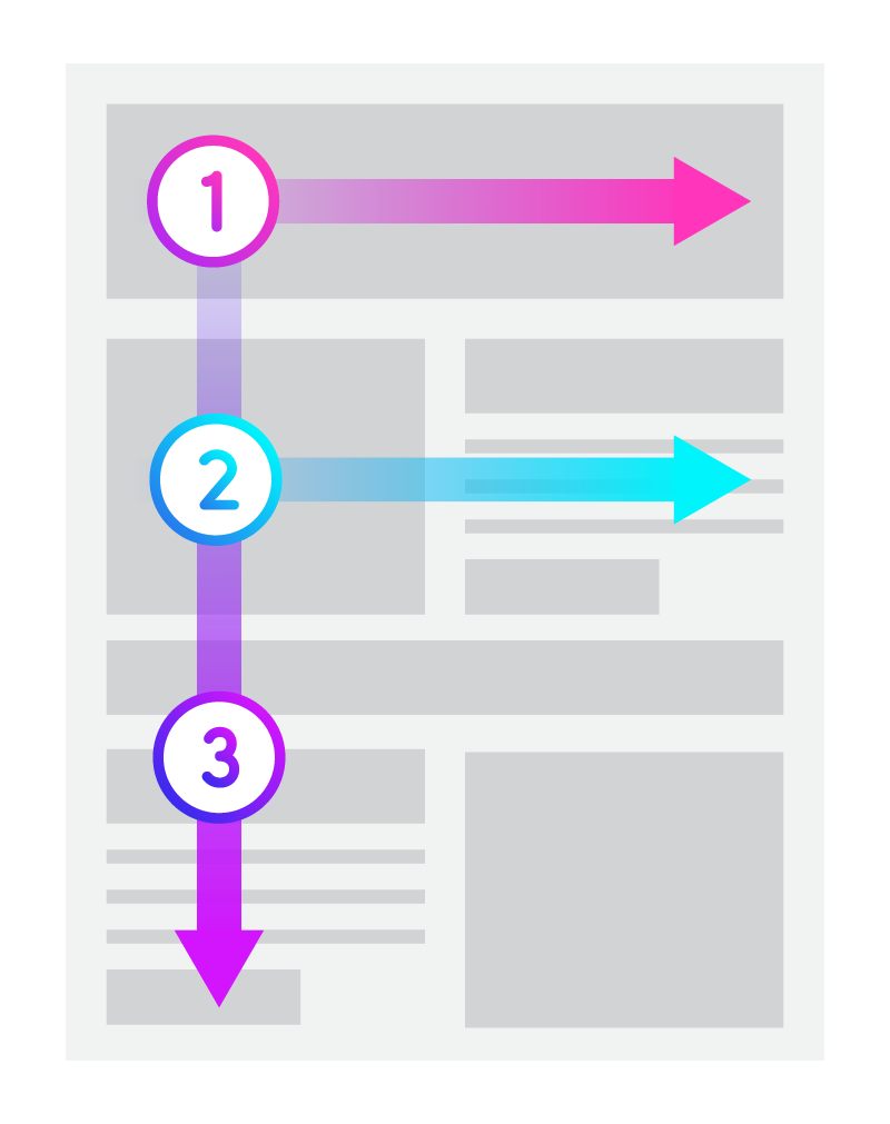
The F-Shaped pattern states that people scan webpages and phone screens in the letter of an F. This was supported by User Experience researchers, who performed eye-tracking research to catch the eye movement of the subjects. It usually begins with users reading in a horizontal movement across the upper rows, and then moving down to the following rows, but covering a shorter area than before.
The F-Shaped pattern is a very popular term used by UX designers and Web developers. It is a framework that is used to ensure that the overall user experience is of a satisfactory level. The use of an F-Shaped pattern can be applied to any product or service, as long as it requires the users to utilize their eyesight. Some examples of its use can be on web pages, books, and advertisements.
If you are still skeptical about the F-Shaped pattern, then ask yourself this question. When you are reading something on your phone, are you programmed to start from the top left, then proceed to read to the right, and then move on to the next line? If you answered yes, then you are unknowingly adopting the F-Shaped pattern.
How can the F-Shaped Pattern help a data analyst?
As a data analyst, you are required to let your stakeholders spot the key figures with little to no effort. The lack of guidance to these key figures will usually lead to stakeholders feeling overwhelmed, slowly turning into frustration, and potentially not using the dashboard in the long run. That is NEVER a good thing to hear as a data analyst
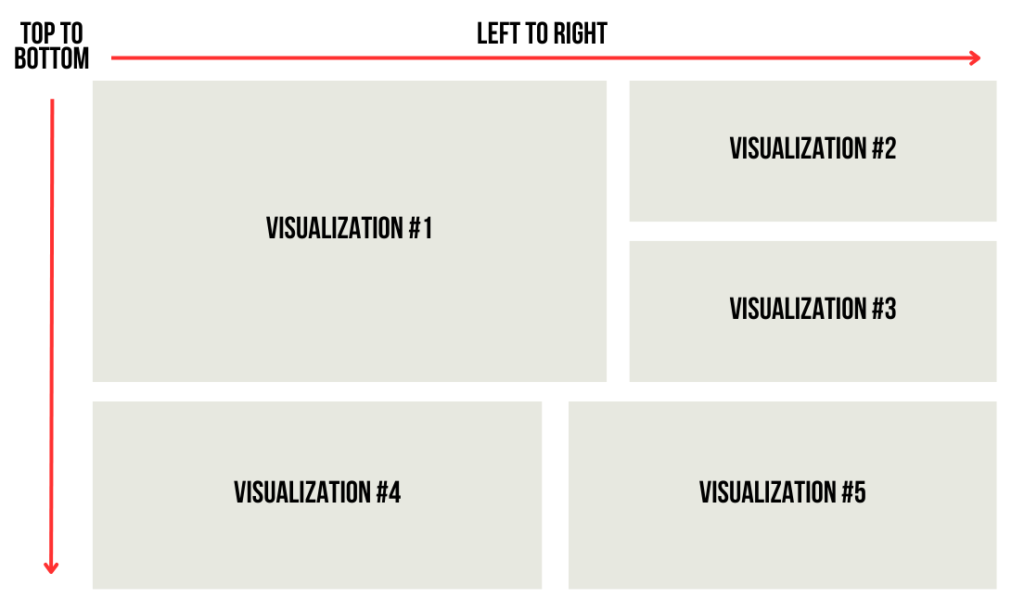
Understanding the F-shaped pattern lets you know that users usually start their viewing material on the top left, before scanning across the row, and moving to the next row. This means that the answer to the dashboard’s main question SHOULD ALWAYS BE AT THE TOP LEFT. Doing so will allow your stakeholders to experience the following:
- Satisfaction from a question that they had without having to look for it in the Dashboard
- Be curious about why the key figure is in a certain way
We can then proceed to show insights explaining the key figures in an F-shaped format, having the next visualization answer the previous ones. The end state of the dashboard will look something like a storybook, where a page will begin from the top left, and ends at the bottom right.
Example – Expense Tracker
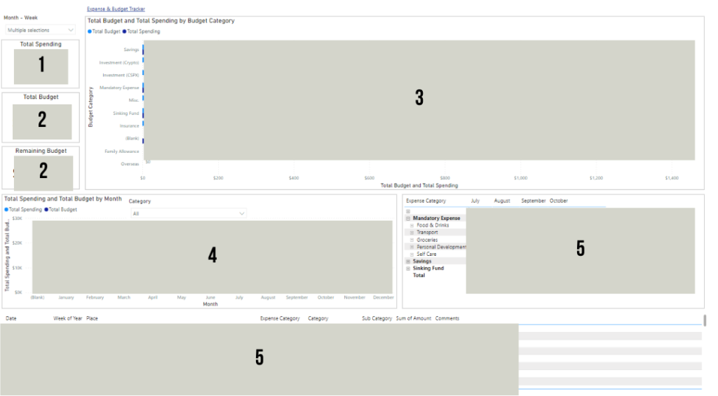
Using the F-Shaped Pattern, here is how the flow of the dashboard goes:
- What is my Spending for the month of October?
- Oh, I’ve spend $x,xxx so far. Has it exceeded my budget?
- I’ve exceeded my budget this month! What am I spending on that is causing my budget to exceed this month?
- Okay, category XXX is the reason why I’ve exceeded my budget this month. Has it been consistently like this the past few months?
- Even though category XXX is the main reason why it has exceeded, I am still unsure what exactly caused it. What did I spend in category XXX that caused me to exceed my budget this month?
Notice how the story of a person’s monthly expense starts from the top left and ends at the bottom right with the key insights required on his/her spending? With the use of the concept of “Storytelling with dashboards” and the “F-shaped pattern”, we created a dashboard that seamlessly tells the user his spending in a simple, yet effective way. This is why the utilizing the F-shaped pattern can be so effective when building your dashboard
Personal Thoughts
Having a good understanding of user interface can be of good use to a data analyst, as it will allow you to understand how you can effectively tell a story in your dashboards. The F-Shaped Pattern is one of the many ways to tell a story in your dashboard. It gives you a general sensing of where users eyes will go to, and allows you to put key information/metrics in the right places.
What are your thoughts on the F Shaped Pattern? Do you think it’s good or bad to implement it into your dashboards? Let me know in the comments section below.
If you enjoy my post, be sure to follow me on Instagram and Medium, as I post my thoughts on being an effective data analyst in a working environment.